Showing posts with label digipak. Show all posts

Tuesday, 3 April 2018

DIGIPAK: Final Digipak with Lyric Booklet

Please be aware that I have made it so that the image of my digipak (which is below) has been made so that it is able to be printed out and made into a physical digipak copy. This means the inner panels in the final digipak image are upside down because of how it would look when printing it. Because of this, to make the inner panels easier to look at, I have added an image of the inner panels the right way up - 


THE FINAL DIGIPAK:


LYRIC BOOKLET:
For my lyric booklet I wanted to include a variety of shots of the artists with different costumes throughout - some costumes from the music video for 'bloodstream' and some with the costume from the front + rear digipak panels images. 
...
Front page of lyric booklet
For the front panel of my lyric booklet I decided to choose the front cover image of my digipak. 


1st page of lyric booklet
I experimented with lots of different effects for my lyric booklet, for this first page I layered an image from my music video for the track 'bloodstream' over an image of the artist wearing the same costume as in the front panel image and back panel image. This creates a sense of branding between the 2 products (digipak + music video).

I wanted there to be a small link between  the lyric booklet and the digipak external panels (front + back). 

I then put a pink solid colour layer over the two image layers and changed the blending mode so that you could still see the image of the artist. 

Here is another page of my lyric booklet. I took an image of the artist wearing one of costumes that she wore in my music video for 'Bloodstream'. This creates a sense of branding between the two products (digipak + music video). 


Back page of lyric booklet


I made 2 digipak unwrapping videos for the Evaluation Question 3a - Audience, in the first video below, I act as a fan who has just bought the digipak from the store HMV and then doing an unwrapping video. Then in the second video I act as the artist, Astrid S, launching/unwrapping the first ever printed version of the digipak album and showing fans, giving them exclusive info about it.
...

...

...

Tuesday, 20 March 2018

DIGIPAK: Front & Back Panel Draft 2

FRONT COVER/PANEL
...
This is my 2nd draft for my front panel, I was influenced to create a tiling effect. The album name would tile vertically behind the image of the singer/artist. 


...
I was influenced by this example 'Tessa Rae - Wrong With Me'. The album title is tiled vertically down the centre in the same colour font. The album title is also in uppercase bold lettering. The tiling album title is positioned/arranged behind the image on the album cover (the purple feather). 


...
I was also influenced by these album covers to do this tiling effect. The first image here on the left is the album 'SWIMS - 1 Drink'. The second image below on the left is the album 'SWIMS - Excuses'. They both use the vertical tiling effect but instead of being directly in the centre of the cover, it is on the right side. The album titles are in uppercase bold lettering. 


This example also uses vertical tiling effect for album title. Album title in lowercase lettering with only an outline of the letters shown. This example is: SATICA - Dysfunctional (feat. SAKIMA)
BACK COVER/PANEL
...


...

Thursday, 8 March 2018

DIGIPAK: Summary of Themes Multiple EGs

In this next post, following the post on an initial comparison between Ellie Goulding's 'Halcyon Days: Special Edition' and Eminem's 'Curtain Call: The Hits', I have listed the themes I will cover for some more digipak examples:
  • Colour Scheme
  • Artist Logo/Fonts
  • Small Print, Barcodes, Logos
  • Lyric Booklet/Booklet
  • Inner Panels
  • Front Panel (Link with back panel)
  • Back Panel (Track-listing)
  • Spine
  • Edition/Album Info Stickers
...
...

Friday, 2 March 2018

DIGIPAK: Initial Comparison Between Ellie Goulding - Eminem EGs

In this post I will be comparing the two digipak examples Ellie Goulding's 'Halcyon Days: Deluxe Edition' and Eminem's 'Curtain Call: The Hits' based around the following themes:

  • Colour Scheme
  • Artist Logo/Fonts
  • Small Print, Barcodes, Logos
  • Lyric Booklet/Booklet
  • Inner Panels
  • Front Panel (Link with back panel)
  • Back Panel (Track-listing)
  • Spine
  • Edition/Album Info Stickers
...

...

Tuesday, 28 November 2017

DIGIPAK: Initial Ideas

I took many photos of myself as Astrid S during the summer holidays which you can find here on my previous blog post. I decided to try a bit of experimentation with these images I took, taking advantage of the fact that the images I took were in front of a greenscreen. 
...
For these first few images I experimented with space galaxy images because I thought it would create an ethereal, beautiful, unworldly feel. 


Gabriel Gassi - Street Phone
For these next few images, I did not stand in front of a greenscreen but instead, I decided to stand in front of the sky on a beautiful warm sunny day when the sky is a nice bright blue. I really like the effect it has created. I was influenced to do this - the singer/artist stands in front of the sky in a low angle - by the album cover example Gabriel Gassi - Street Phone, from the music video example Kendrick Lamar - ELEMENT and from the music video example Sigrid - Plot Twist.


Kendrick Lamar - ELEMENT.


Sigrid - Plot Twist
Sigrid - Plot Twist


VODCAST 2: General Digipak Conventions

Here is a vodcast I made which summarises general genre digipak conventions. I looked at many examples which helped me to discover what the common conventions were for general digipaks.  
...
...

Wednesday, 4 October 2017

DIGIPAK: Tracks Chosen

I have done research into the common amount of tracks that you will see on an album in the electropop genre. I looked at Halsey's 'Hopeless Fountain Kingdom' and 'Badlands'. Also, I looked at Melanie Martinez' 'Cry Baby' and Ryn Weaver's 'The Fool'.
...
Halsey's 'Hopeless Fountain Kingdom' album
...
Halsey's 'Badlands' album
...
Melanie Martinez' 'Cry Baby' album
...
Ryn Weaver's 'The Fool' album
...

Most of the electropop artists I looked at had only EP's with 1-6 tracks on it. The artist I have chosen has several EP's but no full proper albums just yet as you can see here:
...
Astrid S's 'Bloodstream' EP
...
Astrid S's 'Party's Over' EP
...
Astrid S's '2AM' EP
...
Astrid S's 'Hyde' EP
...

I also noticed that the 'Deluxe' versions of the album had a lot more tracks than the originals. 

I have decided on which tracks to include in my digipak for my artist, Astrid S. I picked my own personal favourite tracks of hers and a lot of her greatest hits. I haven't decided on the order of the tracks just yet but these are the tracks I have chosen:

1. Hurts So Good
2. Bloodstream
3. Does She Know
4. Hyde
5. 2AM
6. Breathe
7. Think Before I Talk
8. Such A Boy
9. Paper Thin
10. Party's Over
11. Jump
12. Atic
13. I Don't Wanna Know

3 Bonus Live Tracks 
14. Hyde (Live From Studio)
15. Paper Thin (Live From Studio)
16. Hurts So Good (Live From Studio)

Tuesday, 5 September 2017

WEBSITE & DIGIPAK: Images

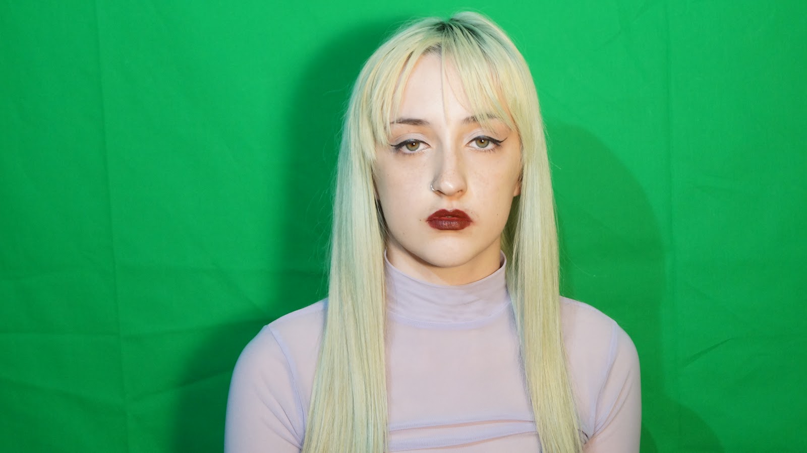
Here are a few pictures I took during summer at my house in England. I took advantage of the sunny weather and took many pictures outside in direct sunlight. On top of this, I also took many images inside, in front of a greenscreen. I plan to use these images for my artist's website and for the digipak. I haven't quite decided which image to use for the main cover of the digipak, at the moment I am thinking to use either the 1st or 2nd image below:


I realised that these images were actually really hard to manipulate in Photoshop and crop the background out, especially since my hair is slightly green blonde in those images, the colour is too similar to the greenscreen background. Therefore, I took some more images with a different costume too - light blue long straight wig, black and white checkered mesh crop top, calvin klein bralette, pink lipstick. Here are the images I took (below):
...


Tara Carosielli - Holloway Road album cover

I decided to pick this last image here below on the left. I liked the unusualness of it and the white closing in walls which created quite an isolated, box effect. I was inspired to do this body pose from this album cover example Tara Carosielli - Holloway Road


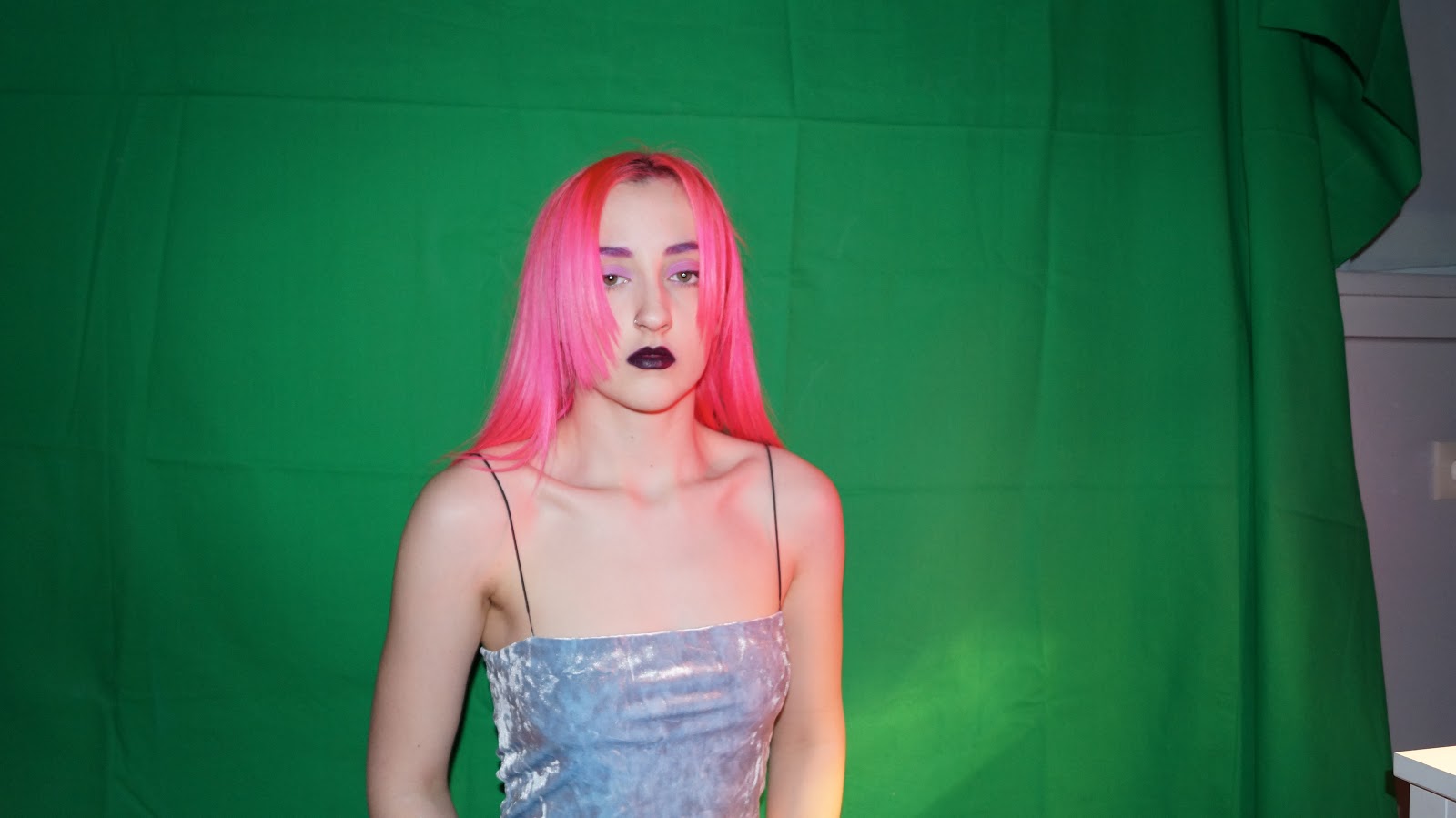
After I placed this image that I chose, onto my website and my digipak, I realised that the image wasn't going to be practical since the background of the image is plain white and grey and not all one colour. Also, there was a triangular section where the arm is placed up and this is difficult to remove the background from. So, I therefore decided to take even more new images of myself with a clearer contrasted background which is green (from green screen) with yet again a different costume (pink hair, light blue scrappy crop top) and a different, simpler body posture which wouldn't cause issues when cropping in Photoshop. You can see the images I took below:
...


In the end I decided on using this image because there is direct audience address and I just like the way I look in this one the most.