Here is the lyric video I have made for the track I chose to make a music video for - 'Bloodstream'. I made it with Final Cut Pro X, I used many of the titles that FCPX has built in the software and I just made the titles sync with each of the lines of the track. Some of the titles fade in, swipe in, turn in etc. I also re-sized some of the titles and changed the colour of them to for example red or pink.
...
...
I was influenced to make a lyric video from many examples such as the ones for Astrid S - Atic, The Chainsmokers - Paris, Bring Me The Horizon - True Friends, Katy Perry - Birthday, Ed Sheeran - Shape Of You, Little Mix - DNA and Demi Lovato - Heart Attack.
...
Astrid S - Atic (Lyric Video)
...
Bring Me The Horizon - True Friends (Lyric Video)
...
Ed Sheeran - Shape Of You (Lyric Video)
...
Showing posts with label website. Show all posts
Showing posts with label website. Show all posts
Saturday, 31 March 2018

Thursday, 29 March 2018
WEBSITE: Viral Concept
 I was inspired to create a viral concept for my artist after being inspired and looking at many examples which did a viral concept too. The original artist Astrid S did a viral concept quite similar to what I have done - she basically posted on her social media including facebook saying: "I'm doing a competition with musical.ly, the winners will be flown into Bergen in Norway to see my concert! (if you are under 18 a parent can come too). To participate you have to dance to Think Before I Talk and use the hashtag #ThinkBeforeITalk and post it!!"
...

...
 This inspired me to create my own viral concept quite similar to this, I created a competition where fans and audience would create a video of them dancing to the song 'bloodstream' and the best dance routine would win (instead of a free trip to Norway to see Astrid S perform) a chance to hang out with the artist Astrid S and get a free astrid_s T-shirt and a signed/autographed copy of the deluxe album digipak.
  I put this competition in a twitter post on astrid 's twitter and instagram (the social media I set up for the artist) and then I set up 3 different twitter accounts (mimicking fans) who would comment/reply to this post with a video of them dancing to the song bloodstream. The accounts - '@orlahogan7', '@diamonddog844' and '@SophieRasmuss20' all commented/replied to the post with a video of them dancing and lip syncing to the song bloodstream.
Here are all these videos that were commented on astrids_music's competition post:
...
posted by @orlahogan7
I rlly love your song bloodstream!! 😍 I made 2 videos of me dancing this is the first one I made - pic.twitter.com/VFWKE4KCDu— Órla Hogan (@orlahogan7) March 29, 2018
Here is the other video I made 🌈 - pic.twitter.com/HnOQ5Dvwjm— Órla Hogan (@orlahogan7) March 29, 2018
...
posted by @diamonddog844
hey astrid! here is my video I suit this wig sooo much omg - pic.twitter.com/diwF1aMWfb— Richard Dannenberg (@diamonddog844) March 30, 2018
...
posted by @SophieRasmuss20
I rlly want to meet u astrid I loveeee you ❤️ pic.twitter.com/2DQmZMw2eH— Sophie Rasmussen (@SophieRasmuss20) March 30, 2018
...
After all the videos were posted I created a competition video for the winner of the competition - I added images of Astrid S hanging out with the winner since in the post one of the prizes was to hang out with Astrid S.
COMPETITION WINNER VIDEO
...
...
Sunday, 25 March 2018
WEBSITE: Visualizer Video
Here is my visualiser video that I made for the track 'bloodstream' (the track that my music video is for too). A visualiser video is a video which gives a sense of how the music video for the specific track will be, it gives the audience a sneak peak/teaser of what vibe the music video will create, a sense of how it will look like, and some of the shots that you will see within the music video. It is technically the equivalent of a teaser film poster. It attracts the audience and gets them intrigued to see more and to see the music video for the track. The visualiser video interacts with the fans and builds up fans' comments and excitement.
...
...
I was influenced to make a visualizer video after looking at Selena Gomez' visualizer video for 'Wolves'.
...
I was also influenced by Chase Atlantic's visualiser video for the track 'Angeline':
...
...
...
...
I was influenced to make a visualizer video after looking at Selena Gomez' visualizer video for 'Wolves'.
...
I was also influenced by Chase Atlantic's visualiser video for the track 'Angeline':
...
...
Monday, 12 March 2018
WEBSITE: Home Page Drafts

This was my very first idea of a layout for the home page of my website. I put the top list menu (with the Home, Bio etc...) in the footer and then froze the footer so that when someone scrolls down, the menu always stays at the bottom of the page.
I inserted a picture of the artist (for the moment until I get pictures of my own) and made it fill the entire page.
I also added a social media bar and put it on the right hand side of the menu to see how it looks.
...

Also, as you can see, I took some photos (mainly medium shots) of the artist for my website with a halogen light on a white background. I am not sure whether I want to crop out the background and change it for something else yet.
As you can see I also put the artist logo in the upper left hand side of the website in the top list/header. In this place, it would immediately attract the viewer's/user's eye which is very important because this is the artist logo, the most important piece of text on the entire website.
I also added a social media bar to the top list to see how it would look in the top list header.
...

I decided to make a scrolling long home page which has separate sections such as Music, Tour, Bio, Social/News, Contact. So, as you scroll down you see each section with media/text in.
...

In this video below, I made a screen recording of my 4th draft of my homepage. In the end I decided on the black colour background for the top list and I added many more social media icons to the top list too. I added in the 'videos' section many of the real Astrid S's existing videos.
...
...
After this I got some feedback and figured that I shouldn't put videos from the existing artist Astrid S, but instead only put my own videos in it. That was quite confusing however because I only have 1 video for my artist which is the music video.


Sunday, 25 February 2018
WEBSITE: Initial Comparison Between Dua Lipa - Metallica EGs
In this post I will be comparing the two website examples 'Dua Lipa' and 'Metallica' based around the following themes:
- Top List
- Artist Title/Logo
- Personal Direct Address
- Social Media
- Merch
- Pushing latest album/splash page
- Colour Scheme
- Buttons/URLS/Links to record label
- Fonts
- Integration of video/YT + other streaming/download
- Format
...
...
Saturday, 17 February 2018

SOCIAL MEDIA 1: Twitter
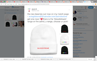
Here is a list of all the social media posts I posted on twitter from oldest to newest:

 Consistently throughout the year, I asked people to comment, pretending to be fans, on each social media post e.g. my friend James commented things which his account - '@jamesjohnson214' and my other friend josh commented with his account - '@joshua_kornfeld', and he also set up fake accounts such as '@Katemarie9921' and '@iamliam62'. I also set up fake accounts mimicking fans e.g. '@ariahayward5', '@httpsadgirltm', '@astridsloverrrr', '@SophieRasmuss20', '@diamonddog844', '@orlahogan7'.


...

...

...

...

...

...

...

...

...

...

...

...

...

...

...

...

...

...

...
...

...

 Consistently throughout the year, I asked people to comment, pretending to be fans, on each social media post e.g. my friend James commented things which his account - '@jamesjohnson214' and my other friend josh commented with his account - '@joshua_kornfeld', and he also set up fake accounts such as '@Katemarie9921' and '@iamliam62'. I also set up fake accounts mimicking fans e.g. '@ariahayward5', '@httpsadgirltm', '@astridsloverrrr', '@SophieRasmuss20', '@diamonddog844', '@orlahogan7'.


...

...

...

...

...

...

...

...

...

...

...

...

...

...

...

...

...

...

...

...

...
Thursday, 4 January 2018
WEBSITE: Font Research
Before I decide on a font for my website and digipak, I have done some research into existing fonts for electropop artists and some artists from other genres.
Charli XCX (electropop):

Tokio Myers (pop, electronic, classical):

Astrid S (electropop):

Post Malone (hip hop):

MØ (electropop):

Mabel (electropop):

After looking at these I have decided that my favourite art the fonts for Charli XCX, Post Malone and Mabel. I think they are quite groovy, electro, techno, disco looking. This has now told me what kind of fonts to start looking for on dafont.com, a website I have used many times for AS Media Studies.
I have now looked through a lot of the fonts under the category: 'Techno/Sci-Fi' and in 'Retro'. I took screenshots of all these fonts I found and liked:
...
...
...
...
...
...
...
Once I downloaded all these fonts, I uploaded them onto wix.com so that I can use the fonts on wix.com while editing my website. I applied each font to the title 'ASTRID S' sometimes like 'ASTRID_S' to see what all the fonts would look like on my website:
...
 Yummy!
 Incopins Clusters
 Dylovastuff
 Bisurk
 Logotronik
 Slurp
Slurp
 Plexifont BV
I would say my personal favourite out of all these fonts is the last one 'Plexifont BV'. I think it looks the most unusual, striking and cool. I think the 4th one is too light and thin. My two least favourites are the 2nd and 3rd ones. I think they are kind of boring and not the right style I'm looking for. However, now, I am going to do some audience research, I'm going to ask many people which fonts they like best out of these through a Facebook survey which all my Facebook friends can see.
I searched on google how to create a survey through Facebook and I found this link which told me what to do.
Here is the process I took:
...


Then, you can look at the results for your survey:

The results from the survey revealed to me that the bold, bigger fonts seemed to be the most well-liked and favoured, e.g. the 'logotronik' font, the 'dylovastuff' font, the 'incopins clusters' font and the 'yummy' font. I also discovered this not only from the survey, but also from a facebook chat group I made where I asked my friends on Facebook what they thought of all the 7 fonts. They told me that they thought the rest were too thin and hard to read and see:
...

...

...
The results narrowed my choices down to the bold fonts. I looked through them all again and decided that actually I didn't like any of them. This meant I would have to do more research and find another font which is bold and striking. Then I remembered, I REALLY like the existing font for the album title of Post Malone's album 'Stoney':
...

 I spent loads of time trying to find this font online somewhere to download and eventually I found a very similar font like this and where to download it from. I found it on dafont.com. It was called 'Planet Kosmos'.
Charli XCX (electropop):

Tokio Myers (pop, electronic, classical):

Astrid S (electropop):

Post Malone (hip hop):

MØ (electropop):

Mabel (electropop):

After looking at these I have decided that my favourite art the fonts for Charli XCX, Post Malone and Mabel. I think they are quite groovy, electro, techno, disco looking. This has now told me what kind of fonts to start looking for on dafont.com, a website I have used many times for AS Media Studies.
I have now looked through a lot of the fonts under the category: 'Techno/Sci-Fi' and in 'Retro'. I took screenshots of all these fonts I found and liked:
...
 |
| Logotronik |
...
 |
| Univox |
...
 |
| Plexifont BV |
...
 |
| Dylovastuff |
...
 |
| Yummy! |
...
 |
| Bisurk |
...
 |
| Slurp |
Once I downloaded all these fonts, I uploaded them onto wix.com so that I can use the fonts on wix.com while editing my website. I applied each font to the title 'ASTRID S' sometimes like 'ASTRID_S' to see what all the fonts would look like on my website:
...




I would say my personal favourite out of all these fonts is the last one 'Plexifont BV'. I think it looks the most unusual, striking and cool. I think the 4th one is too light and thin. My two least favourites are the 2nd and 3rd ones. I think they are kind of boring and not the right style I'm looking for. However, now, I am going to do some audience research, I'm going to ask many people which fonts they like best out of these through a Facebook survey which all my Facebook friends can see.
I searched on google how to create a survey through Facebook and I found this link which told me what to do.
Here is the process I took:
...


Then, you can look at the results for your survey:

The results from the survey revealed to me that the bold, bigger fonts seemed to be the most well-liked and favoured, e.g. the 'logotronik' font, the 'dylovastuff' font, the 'incopins clusters' font and the 'yummy' font. I also discovered this not only from the survey, but also from a facebook chat group I made where I asked my friends on Facebook what they thought of all the 7 fonts. They told me that they thought the rest were too thin and hard to read and see:
...

...

...
The results narrowed my choices down to the bold fonts. I looked through them all again and decided that actually I didn't like any of them. This meant I would have to do more research and find another font which is bold and striking. Then I remembered, I REALLY like the existing font for the album title of Post Malone's album 'Stoney':
...

 I spent loads of time trying to find this font online somewhere to download and eventually I found a very similar font like this and where to download it from. I found it on dafont.com. It was called 'Planet Kosmos'.
  |
| 'Planet Kosmos' font |
Subscribe to:
Posts (Atom)