Showing posts with label audience. Show all posts

Monday, 2 April 2018

EVALUATION Q3a: Audience Engagement

EVALUATION Q3a: How do your products engage with audience
For this question I decided to make 4 different videos: 2 digipak unwrapping videos, a Q and A video session live on twitter and a radio interview with Astrid S talking about audience feedback for her latest music video and website, how it impacted in the production of the video and website and about how web 2.0 is allowing audience to participate actively, especially through social media.

The first thing I did for this question was make 2 digipak unwrapping videos. In the first unwrapping video I am a fan of Astrid S called Ashley who has just bought the new digipak by Astrid S.  

However, before I present these videos, I will state some points about my target audience. After doing some initial research into the audience for Astrid S, I discovered that her primary main audience is females aged 15-24. I looked at Astrid S's existing Facebook page and I found some really useful videos for audience. They are videos which follow Astrid S's fans. I could tell that most of Astrid S's fans were females aged 15-24 from these videos. Here is the 1st video that I found: This video follows some of Astrid S's fans waiting to see her live for her concert in Amsterdam. 
...

...
All the fans who were interviewed and shown on camera were female aged 15-24. Also, these fans may have been dutch since this specific concert that these fans were waiting for was in Amsterdam. 


I noticed that most of the females especially in this video had a 'Brandy Melville' or 'arty' style, Brandy Melville is a clothing store which has quite simplistic, comfy clothing for females which consist of the colours: black, white, beige, cream, burgundy, grey, light brown. 


Here is the second video I found on Astrid S's Facebook. This is a video created by Spotify, where Spotify invite the 20 people who have listened to Astrid S the most on Spotify to an exclusive meeting and intimate concert at Universal Music Norway with Astrid S.  
...

...
Yet again all the fans who were shown in this video on camera were females aged 15-24 with one male who was between 15-24 also. These fans may have been all Norwegian since the setting of the video is in Norway. They all look Scandinavian. 


I have also discovered that since Astrid is touring in mainly Scandinavian countries + The Netherlands at the moment, this could mean her primary target audience is females aged 15-24 from Scandinavian/European countries. 


I also asked my friend James who he thought the target audience would be for Astrid S since I have shown him her music and her style, he responded with this. He said he has a 14 year old sister and an 11 year old sister and they don't listen to electropop genre music yet, but instead they listen to pop music such as Katy Perry, Selena Gomez and Marshmello. 


He said he thinks the target audience for Astrid S is females aged 16-24. 
His 14 year old sister listens to rap and hip hop he said, this could relate to how hip hop and rap music is quite mainstream and at that age girls and boys don't know who they are yet and they are just trying to fit in with the mainstream crowd who listens to rap and hip hop. 


After all this research I discovered that I believe that Astrid S's target audience is females aged 15/16-24 with the secondary audience being males aged 15/16-24. This research has helped me a hell of a lot in determining Astrid S's main primary + secondary audience.  

A way I tried to attract the aged 15-24 primary audience was by having characters in my music video which were aged 17-18. I believed that this would attract a young female and male audience aged 15-24 since there is one 17 year old male character and one 18 year old female character. Also, having looked at many other electropop examples like Halsey, Charli XCX and MØ, I have discovered that their target audience is females aged 15/16-24. This also influenced my idea and decision that the target audience for Astrid S is females aged 15-24.

I still think, however, though, that Astrid S has a secondary audience of tweens aged 10-14. This is because she has easy, language free lyrics and the pop genre side to her music attracts a core audience of people aged 10-14 or perhaps even younger like 8-9 year olds. However, after looking at Astrid S's existing music videos, I discovered that the content in them is sometimes a bit inappropriate for children aged 8-14 e.g. kissing neck, clothing slightly revealing. Also after watching and listening to the track I had chosen to use for my music video - 'Bloodstream', I discovered that there were some slightly inappropriate, edgy lyrics - "touching me gently, holding me close, breathe on my skin, lips down my body".

For gender, I discovered after looking at many examples such as Halsey, Charli XCX, Mabel, MØ, Lorde, Taylor Swift, Katy Perry, that the primary target gender audience for electropop is females because for a start, the majority of artists in the electropop genre are female which brings me to my point on Dennis McQuail's 'Uses and Gratifications' theory - one of the gratifications in his theory is personal identity; since the artist, Astrid S is a female aged 20, this can attract a female audience because they can identify with the artist and relate to them. The pop side of the electropop genre attracts a strong female audience and the electronic genre side attracts more of a male audience. 

DIGIPAK UNWRAPPING VIDEOS
...
Ashley, a fan of Astrid S, unwrapping Astrid S's new digipak after buying it in the store, HMV:


...
Astrid S unwrapping her new digipak:


...

Q AND A VIDEO SESSION LIVE ON TWITTER
Secondly, I decided to do a live Q and A video session with the fans on twitter, with me being Astrid S and people sending in questions through the comments. I made a post saying "Guess what guys! Tonight I am doing a live video Q and A session on my latest products! Comment below questions and I'll answer some of them tonight see you soon"
Here are the questions that the fans commented on that post:

1. On what platforms will I be able to listen to your new album?

2. Where can I buy your merchandise? I really want a hoodie with your logo on it


3. I really want to stay updated on ur new music and events so do you have any other social media other than Twitter?

4. I saw you perform live like 2 years ago when you only had some EPs out so I really want to see you live again now performing ur new album! do you have any concerts coming up?


5. What is your favourite track on the new album?

6. I've loved your music ever since your first EP - 2AM! Does this new album have a special edition of some kind?

7. How do I subscribe to your latest music and news?

8. I love youuu!! Where can I buy your new album?! 


...

...
The Script:

Thursday, 4 January 2018

WEBSITE: Font Research

Before I decide on a font for my website and digipak, I have done some research into existing fonts for electropop artists and some artists from other genres. 

Charli XCX (electropop):


Tokio Myers (pop, electronic, classical): 


Astrid S (electropop):


Post Malone (hip hop):


MØ (electropop):


Mabel (electropop):


After looking at these I have decided that my favourite art the fonts for Charli XCX, Post Malone and Mabel. I think they are quite groovy, electro, techno, disco looking. This has now told me what kind of fonts to start looking for on dafont.com, a website I have used many times for AS Media Studies. 

I have now looked through a lot of the fonts under the category: 'Techno/Sci-Fi' and in 'Retro'. I took screenshots of all these fonts I found and liked:
...
Logotronik


...
Univox


...
Plexifont BV


...
Dylovastuff


...
Yummy!


...
Bisurk


...
Slurp


Once I downloaded all these fonts, I uploaded them onto wix.com so that I can use the fonts on wix.com while editing my website. I applied each font to the title 'ASTRID S' sometimes like 'ASTRID_S' to see what all the fonts would look like on my website:
...
Yummy!

Incopins Clusters


Dylovastuff


Bisurk


Logotronik


Slurp


Plexifont BV


I would say my personal favourite out of all these fonts is the last one 'Plexifont BV'. I think it looks the most unusual, striking and cool. I think the 4th one is too light and thin. My two least favourites are the 2nd and 3rd ones. I think they are kind of boring and not the right style I'm looking for. However, now, I am going to do some audience research, I'm going to ask many people which fonts they like best out of these through a Facebook survey which all my Facebook friends can see.

I searched on google how to create a survey through Facebook and I found this link which told me what to do. 

Here is the process I took:
...


Then, you can look at the results for your survey:


The results from the survey revealed to me that the bold, bigger fonts seemed to be the most well-liked and favoured, e.g. the 'logotronik' font, the 'dylovastuff' font, the 'incopins clusters' font and the 'yummy' font. I also discovered this not only from the survey, but also from a facebook chat group I made where I asked my friends on Facebook what they thought of all the 7 fonts. They told me that they thought the rest were too thin and hard to read and see:
...


...


...

The results narrowed my choices down to the bold fonts. I looked through them all again and decided that actually I didn't like any of them. This meant I would have to do more research and find another font which is bold and striking. Then I remembered, I REALLY like the existing font for the album title of Post Malone's album 'Stoney':
...
I spent loads of time trying to find this font online somewhere to download and eventually I found a very similar font like this and where to download it from. I found it on dafont.com. It was called 'Planet Kosmos'. 


'Planet Kosmos' font


Saturday, 22 July 2017

MVid EG1: Astrid S - Such A Boy

POSSIBLE INFLUENCES:
1. The excessive use of colour correction and colour gels (for lighting - colourful lighting). 
3. The locations e.g. indoor in a bathroom, in a bowling alley, in a bedroom, at a party full of people.

Act: Astrid S
Track: Such A Boy
Year: 2017
Director: 
Genre: Electropop
Main Audience: Females (15-24)

There are 18 shots in the first 30 seconds. That estimates that each shot lasts 1.6 seconds. 
...

...

There is frequent use of colour correction and colourful lighting (created with colour gels) in this music video. I am really inspired to use this for my music video, I really like it. 

Andrew Goodwin's '6 conventions of music videos' can apply to this music video. There are frequent close up shots used of the singer, Astrid S lip syncing. There are also frequent electro pop genre signifiers used such as the excessive colour correction/colourful lighting (created with colour gels). 

Laura Mulvey's 'male gaze' can be somewhat exploited in this video because of how the artist is glamourised throughout with either pink lipstick or lipgloss, lilac nail varnish, black mascara, either silver earrings studs or bangles, foundation, blusher and black eyeshadow. You can denote that her eyebrows are plucked and shaped nicely also. The pink lighting on her for example at the start as you can see in the image on the left, helps to further glamorise her and make her appear very feminine. The shot on the left is of a boy about to kiss the artist's neck which is not something which would attract a young tween audience but instead, an older teen audience aged 16-25.

There are also many shots of the artist showing her shoulders in thin strapped tops/dresses. She is also a white caucasian blonde female so this is a normative representation of females. She also has mid-length long hair which further enforces this normative representation. Later on in the video you see a close up two shot high angled shallow field of focus shot of Astrid S looking in direct audience address with the boy in the background out of focus. In this shot she is wearing a thin strapped pink ribbed tight dress which shows her cleavage - this is clear evidence of the 'male gaze' theory being exploited. 

She is also eating candy floss at the same time - the fact that she is looking in direct address while biting into something has sexual connotations, therefore glamourising and sexualising Astrid S which can attract a male audience. It also signifies that her audience are not young (e.g. tweens aged 10-13) but instead they are young adults aged 16-25. However, the candyfloss element could be considered as an attempt to create a playful vibe to the music video which could therefore attract a younger audience (aged 13-15).

You could say the 'female gaze' is also being exploited in this video due to the high key colourful lighting clearly glamorising the male character as you can see in this image below.

The boy is sucking on something or has something slightly in his mouth in the lower image, the female gaze being exploited because this is a sexualised pose that you see male models do for modelling images - as you can see here in this example on the right for this 'Spicebomb' perfume. There is lighting coming from many different angles in this image on the lower right, to create a glamourised effect on the facial features and skin. For example you can see some sections of the face are dark blue and some are pink. The jaw/neck, which is a glamorised feature of the male face, has clearly been purposely lighted a different colour to the rest of the face. 
This boy character is being glamorised and sexualised by being in this pose which connotes that the Astrid S's (the artist) audience is not young but instead is older teens (aged 16-25). 


There is also use of direct personal address in the video from the singer, Astrid S. This creates a personal connection between the artist and audience/fans. This is a common convention of music videos of any genre. While she is with her lover character in the video she is looking at the audience while the lover character is looking at her or doing something to her like kiss her neck. 

I also noticed this technique/effect was used in Astrid S's music video for 'bloodstream'. This makes the audience really empathise with her and relate to what is going on in the video, this can be tied nicely with Dennis McQuail's 'Uses and Gratifications theory' - the personal identity gratification is relevant here - the female audience members at a similar age to Astrid S (aged 20) or younger (aged 16-18) can relate and identify with Astrid S. 

Thursday, 15 June 2017

MVid EG3: The 1975 - Sex

POSSIBLE POINTS OF INFLUENCE FOR MY MUSIC VIDEO:
1. The trippy colours used. 
2. The use of naturalistic locations. 
3. The footage of the teen characters doing naturalistic teenage activities.
4. The footage of the teen couple kissing, touching each other and on top of each other. 
5. The performance footage of the band. 

Adam Powell (2013)
Act: The 1975
Track: Sex
Genre: indie rock
Main Audience: Females and Males (16-24)

The first 30 seconds consists of dialogue with 4 shots. From 0:30 to 1:00, there are 19 shots. This estimates that each shot lasts 1.6 seconds. 
...

...

There narrative to this music video is non-linear, the end is at the start where the male character gets caught by the police. 

There is a mix of narrative and performance footage in this video, so, Simon Perth's performance, concept and narrative theory can be applied here. There are shots of the band performing with instruments such as electric guitar, drum kit, this all creates verisimilitude for the video. The narrative footage blurs with the performance footage at points for example when the band perform around the couple having sex/on top of each other kissing on a worn out discoloured mattress. 

There is very naturalistic colour correction to almost no colour correction used at all in this music video with a slightly grainy effect on all the footage. This effect has been used to connote the naturalistic and gritty side of the video. The 1975 band has an already existing branding which consists of the colours black and white, smoking cigarettes, wearing black dark clothing, having tattoos, wearing doc martens etc. They have quite a grungy, dark, gritty style, similar to Arctic Monkeys. 

There is also a lot of nudity (female nudity) within this video and mature, explicit inappropriate behaviour such as smoking weed and having sex. 

I believe this video would get an 18 age rating from the BBFC. When you watch this video on YouTube, the vevo age verification screen comes up where you have to confirm that you are 18 years old or older.  

MVid EG2: Halsey - Ghost

POSSIBLE POINTS OF INFLUENCES FOR MY MUSIC VIDEO:
1. The coloured lighting, neon colours, pastel colours 
2. The slow motion effect on the characters moving. 
3. The costumes used in the video e.g. the blue bob wig, pink bob wig, red lipstick, choker, black eyeshadow, black eyeliner etc. 

Malia James (2015)
Act: Halsey
Track: Ghost
Genre: electropop 
Main Audience: Females (13-24)

There are 11 shots in the first 30 seconds. This estimates that each shot lasts 2.7 seconds.
...

...
At the start of the video, there is a medium long shot/long shot of a city with high skyscrapers and lots of banners everywhere with Chinese writing on. This denotes the setting to be urban and a 'big city' perhaps in the country of China or Japan. However, the location hasn't been intentionally anchored, it has been left as polysemic with asian signifiers through chinese script. The issue here is globalisation - where is this city - this is a city anywhere - not western or eastern which is an aspect of representation and post modernism, a refusal to accept a certain reality - any place any reality. 

There is use of a diegetic title at the start of the video. This title is the track title. There is also another title which is the track title 'Ghost' translated in Chinese. 


Andrew Goodwin argued that there are 6 features of music videos, these can be seen in this video. These are: frequent close ups of artist, genre characteristics, relationship between lyrics and visuals, relationship between music and visuals, the notion of looking and intertextual references. First of all, there is frequent use of close ups of the artist, Halsey in this video. 


There are electropop genre characteristics in this video such as the use of bright neon, primary colours throughout (created through colour gel lighting and colour correction) and the iconic, flamboyant costumes seen which are a light blue wig, a light pink wig, a choker, bright red lipstick and heavy black eye make-up.


Laura Mulvey's male gaze' is somewhat exploited in this music video through the close ups and medium close up shots at the start of the video of Halsey and another girl's body. They are heavily glamourised through the use of high key lighting, sometimes with the use of colour gels and also colour correction. This is one of the key conventions of the electropop genre (colour correction, SFX, use of colour gels). I am influenced by this video to use colour gels for lighting in my music video on the lip syncing footage of the singer and on some of the narrative shots. 

In terms of the Uses and Gratifications theory (Dennis McQuail), 3 of the gratifications apply here. Personal identity, personal relationship and diversion. Females aged 15-24 are able to identify with the female main protagonist, Halsey, in this music video. The same gratifications will apply to my music video. 

There is a playful post modern deconstructionist pomo aspect to this video due to the fact that the two female main protagonists look very similar because of the wig 'bobs' they are wearing, one is wearing a short bob pink wig, the other is wearing a short bob light blue wig. The first scene is where this is most evident. The editing choice of this first scene tricks/challenges the viewer and gets them confused as to which female is Halsey (the singer/artist). At one point Halsey is on the right while kissing and touching the other girl and then at another point Halsey is on the left side instead. This confusion is also created through the shot choices - through, for example the side on close up two shots of the two female characters, it is very hard to distinguish which female protagonist/character is Halsey. 

Also, it is clearly denoted that the narrative and performance have been blurred. Halsey is blurring the narrative and performance. The same colour correction is used on the lip syncing footage of the singer and the narrative footage of Halsey with the other female character. However, in the narrative shots, Halsey has a short light blue bob but in the performance shots, has significantly longer light blue hair. Halsey's bob hair in the narrative shots matches the hair of the other female character in the video intentionally.

In terms of editing style, a slow motion effect has been used on all of the footage. This creates a flowing effect. 

Information on electropop genre music video conventions gathered:
1. Use of colour correction, colour gels in lighting to look colourful 
2. Flamboyant costumes - colourful, vibrant costumes

MVid EG2: Chase Atlantic - Swim

POSSIBLE POINTS OF INFLUENCE FOR MY MUSIC VIDEO:
1. The clothing and hairstyles of the trio. 
2. The club location with lots of flashing and colourful lights. 
3. The purple colour correction used on the outdoor footage on the cliff. 
4. The drone shots of the rocks in the ocean and the settings. 
5. The diegetic titles at the start for the artist name and the track name. 
6. The diegetic titles of some of the lyrics of the song.  
7. The editing style - cutting to the beat 
8. The flashing effect on the footage. 

Act: Chase Atlantic 
Track: Swim
Year: 2017
Genre: Hip Hop, Electronic
Main Primary Audience: Females and Males (15-24)
...

...

Throughout this music video, you can see multiple costume changes from the artist. 

You can also see in this video, many locations used, for example, at the start of the video the artist trio stands on a cliff, then later you see shots of the lead singer of the trio in a club setting. 

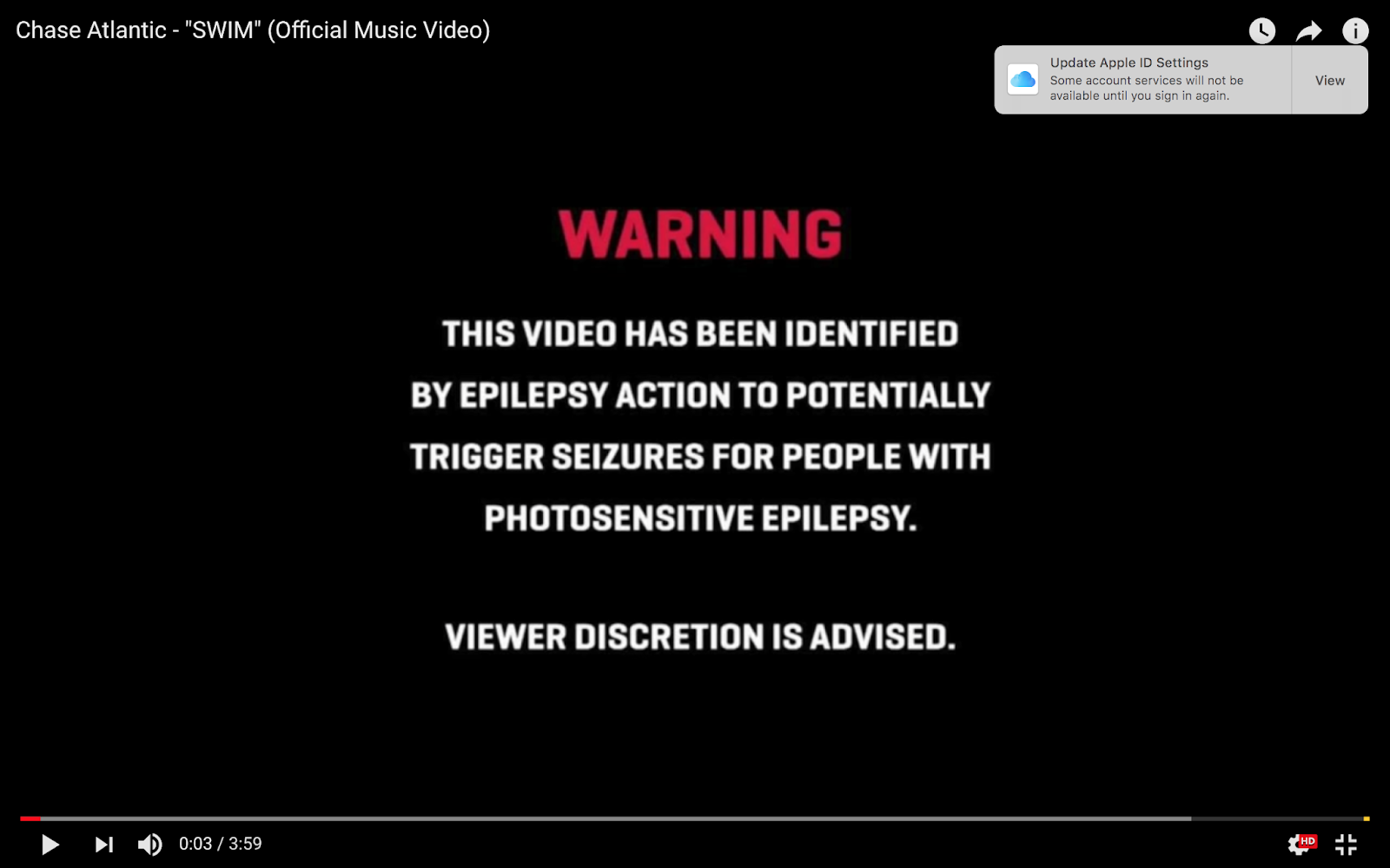
This music video has a title at the start with the artist's name - 'Chase Atlantic'. There is also a title before that which warns the audience/viewer that this video has a lot of flashing image and can be harmful to people with epilepsy. This is become quite an important thing to do lately, informing the viewer about the video in case they have epilepsy. 


For this music video, Simon Ferth's 'Narrative, Performance, Concept' theory can be somewhat applied. However, in this video you can only mainly see solely performance from the artist. There is no narrative evident in this video. 


Andrew Goodwin's 6 conventions or features of music videos theory can be reflected in this music video example. There are multiple genre signifiers of hip hop such as the dancing footage of the artist, the style of dancing has a lot of hip hop connotations. The second convention he states is that there is a relationship between the visuals and the lyrics. As you can see in the image below, there is an animation of pills raining down - this appears on screen on the lyric line of the track "Pop a couple pills in the daytime". 

The main thing to note about this music video is the frequent use of special effects or SFX. As you can see on the right, there is an animation within the video of pills falling down like rain. Also in the image above on the left, there is use of layering over a shot of a human prototype and a medium shot of the lead singer of the trio, heavy purple colour correction, glitch effect and a human prototype animation. This combination creates quite a striking visual as you can see.  

There is also a very fast editing pace and striking editing style for the video. The visuals on screen cut to the beat of the song and there is a flashing effect used on the footage and the transitions between shot takes.